Endangered Species Chocolate
Indulge in a cause.
2025
How do you transform a chocolate brand into a conservation movement?
When Endangered Species Chocolate was founded in 1993, it was rooted in two passions: premium, ethically sourced chocolate & wildlife conservation. From the beginning, ESC was built on the idea that everyday choices can create extraordinary change.
Since 2016, ESC has donated over $2.6 million to its Give Back Partners with funds directly supporting global conservation efforts. By 2027, the brand has set its sights on an ambitious milestone, donating $1 million annually to protect species, habitats, & humanity.
But today, it’s no longer enough to simply be a brand that gives back. To rally a new generation of conscious consumers, ESC needed to evolve visually & strategically.
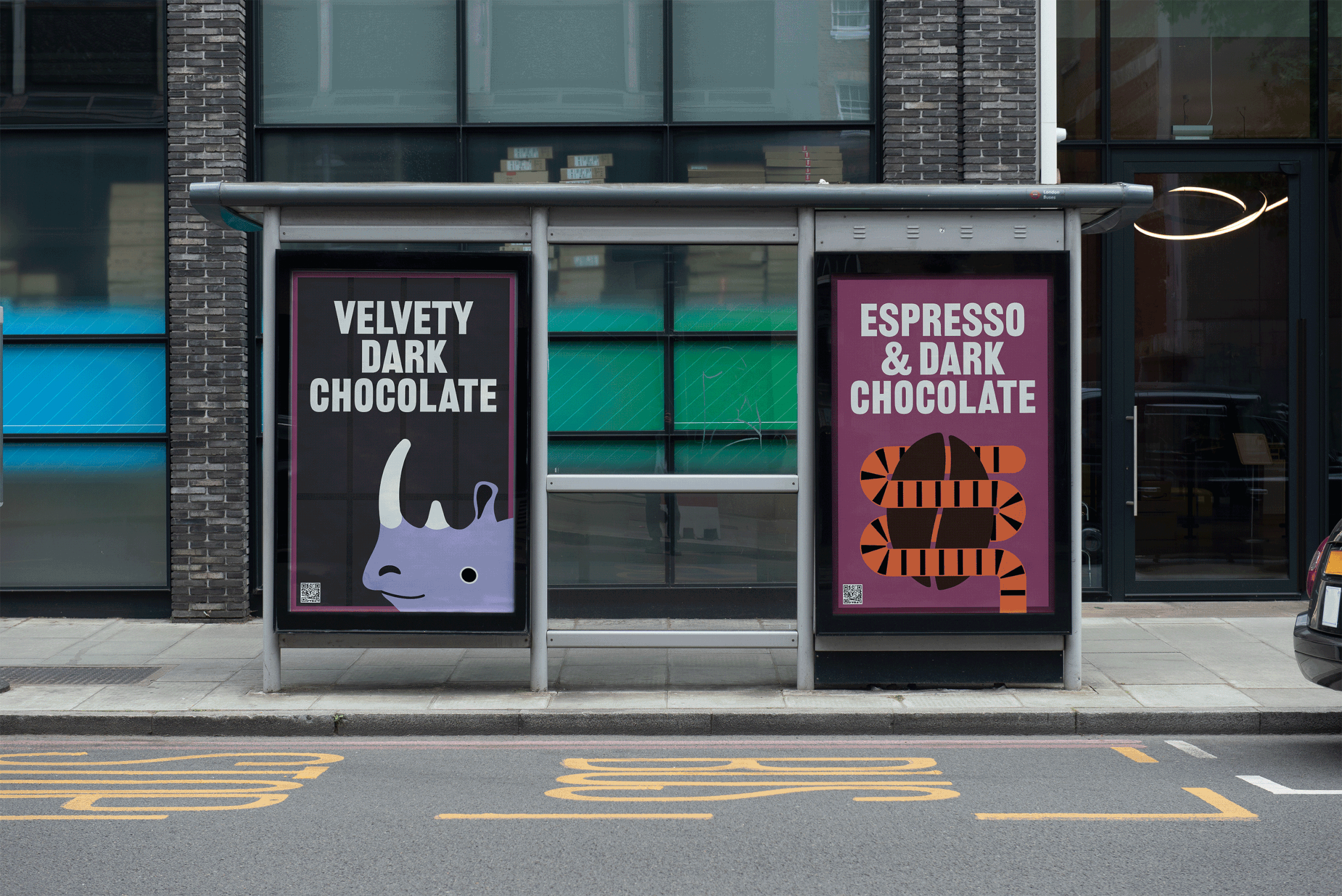
The rebrand positions Endangered Species Chocolate as more than a chocolate company, but a movement. Through bold design, playful storytelling, and an unapologetic activist tone, the reimagined ESC invites people to indulge as a radical act of care for the planet.
Why Endangered Species Chocolate?
People reach for Lindt for luxury, or grab a Tony’s Chocolonely bar because it’s bold, ethical, and hard to ignore. So, why would someone choose Endangered Species Chocolate?
In the current lineup, ESC highlights ingredients alongside colorful, abstracted patterns that allude to wildlife. While visually unique, the ambiguity weakens the brand’s core message, diluting the one thing that sets it apart on shelf: its commitment to conservation.
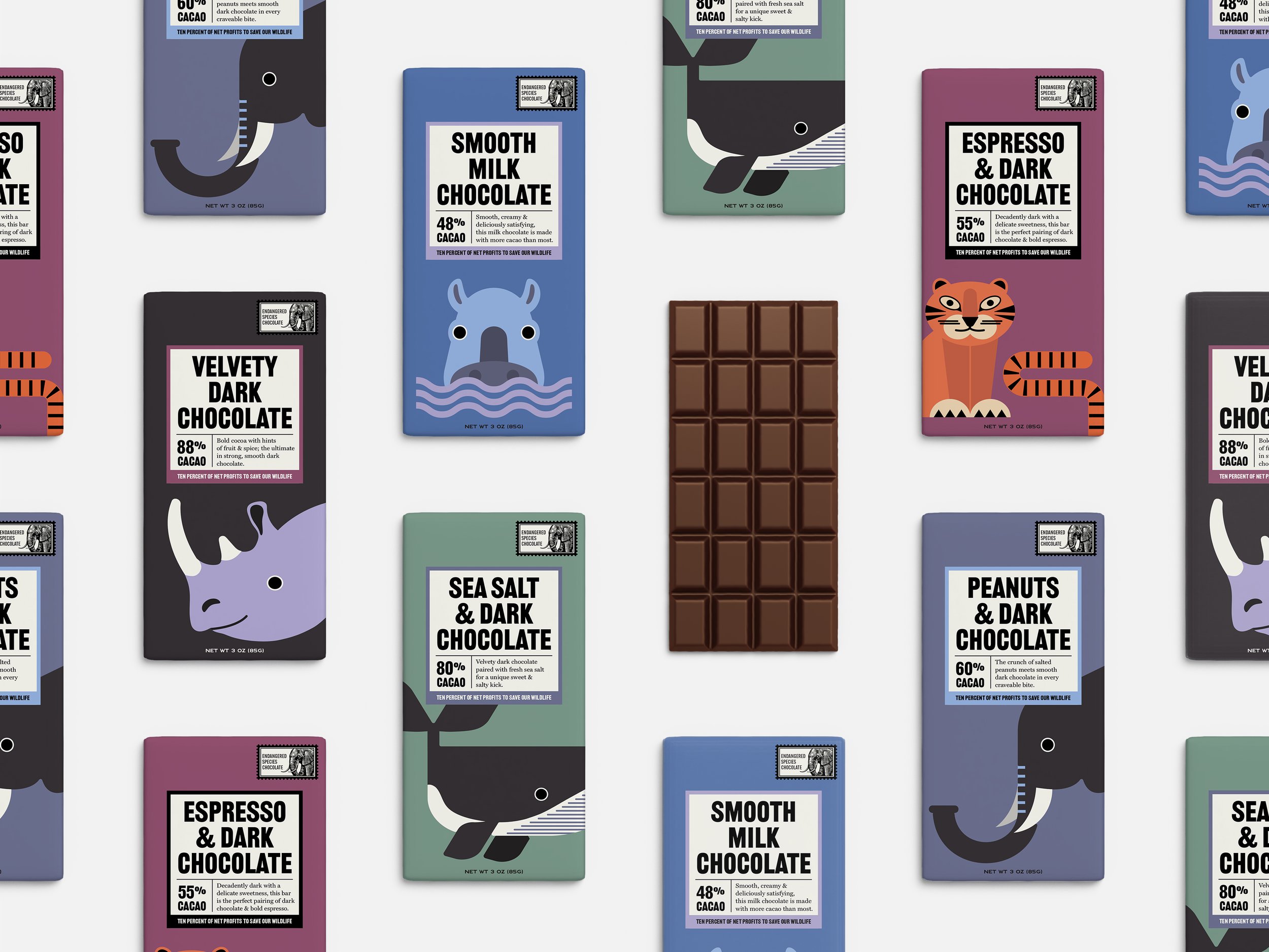
To stand out, I took a new approach by placing the endangered species front and center, refocusing the attention of what makes ESC worth grabbing in the first place.

A selection of current packagingEvolution
By bringing the endangered species to the forefront, the brand visually reinforces its mission at a glance. The bold, graphic animal illustrations are modern yet playful, and the vibrant color palette has a striking shelf presence that proves being environmentally friendly doesn’t have to be boring and predictable.

Chocolate with a wild side
Current logo


A balancing act
Who said conservation can’t be fun? The new identity is infused with a sense of play to balance out the seriousness of the subject matter. The ESC animals make messages around saving our species more digestible for audiences by being playful rather than preachy. A big, smiling tiger sits next to bold type on the pack, making the brand approachable & lighthearted.

I reimagined the original logo, which features Eleanor the elephant, a symbol of ESC’s mission to protect species, in a delicate line work style that serves as a visual counterpoint to the bold geometry used throughout the visual identity system.
The original thin-stroked type was replaced by a more legible alternative, and the patterned border was reinterpreted as a postage stamp motif. The small touch acts as a nod to the chocolate’s Fairtrade origins and global journey.


Subtitle